
Looking for the best wedding planning app? Here’s my honest Bridebook review, exploring its features, benefits, and whether it can simplify your big day planning!
User Experience: The Bridebook Adventure
Wedding planning: it’s part magical fairy tale, part logistical nightmare. Enter Bridebook, a tool that promises to transform your chaos into calm and make the whole process—dare I say—enjoyable? I dove headfirst into Bridebook’s digital universe, and here’s the tea on whether it delivers.
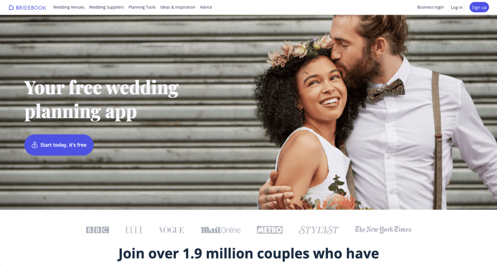
First Impressions: Desktop Meets Wedding Vibes
Bridebook has both a web and mobile app because, obviously, wedding planning waits for no one—not even your lunch break. I’m a Millennial and a sucker for a big screen when I’m deep in planning mode, so I opened the web version.
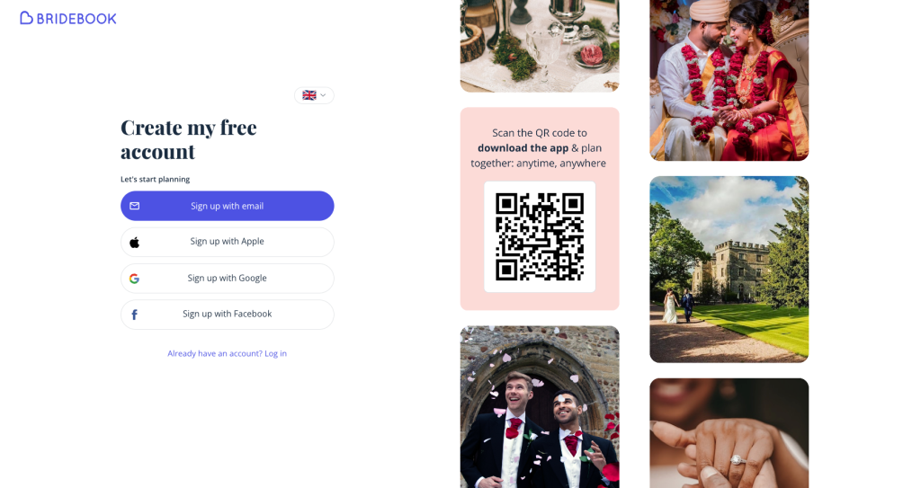
First up: creating an account. They give you options—Google, Apple, email, even Facebook (because apparently, that’s still a thing). Oh, and a QR code for app downloads. I went with Google because it’s quick, and I’m already in a long-term data-sharing relationship with them. Signing up? Painless.
Onboarding: Wedding Therapy with Emojis
Bridebook’s onboarding process feels like wedding therapy in app form. It holds your hand, asks all the right questions, and makes you feel like you’re actually making progress (even when you’re just picking emojis).
- Names and Partners: “Add your partner to plan together!” they said. And for once, it didn’t feel like an afterthought. Collaborative planning? Yes, please.
- Your Wedding Vision: This step asks you to pick 3–5 descriptors (with emojis!) for your wedding vibe. Options like “big party” and “festival” made me smile, but honestly, I was sweating. How do I sum up my dream day in five emojis? At least they gave me a skip button.
- Dates, Venues, and Budgets—Oh My!: The questions get real, fast. “What’s your ideal wedding date?” “What’s your total budget?” These felt like big commitments, but Bridebook softened the blow with handy tips like, “Marry in winter and save money!” (Not groundbreaking, but appreciated.)

Planning Hub: A Type-A Dream Come True
Once you’re through onboarding, Bridebook drops you into its planning hub. This place is a type-A dream: checklist, budget tracker, guest list—all in one spot. Here’s the breakdown:
- Checklist: Organised by month, with bite-sized tasks like “Pick a venue” and “Tell people you’re engaged.” Ticking off tasks is oddly satisfying, and yes, I ticked off “upload profile pic” just to feel accomplished.
- Guest List: The guest list tool is like a CRM for your wedding. Bulk add names, track RSVPs, and collect addresses via a shareable link. It even lets you tag plus-ones. A little buggy, but overall, a lifesaver.
- Budget Tracker: Bridebook estimates costs based on averages for UK weddings. It’s like having a friend who knows exactly how much flowers will cost (and how much they should cost).
- Saved Favourites: Venues, suppliers, and vendors all live here. There’s even a compare button for quick side-by-side analysis. Efficient, and dare I say, fun?

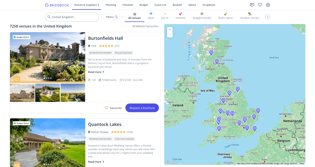
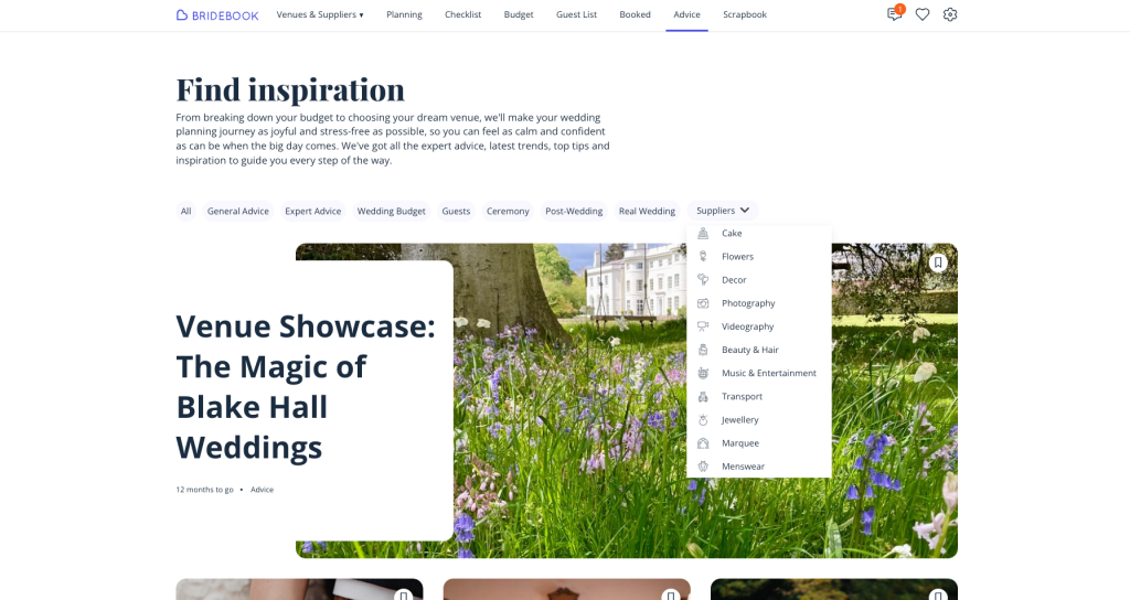
Venue Search: Overwhelming but Worth It
Bridebook’s venue search is like opening a giant box of chocolates: exciting, but you have no idea where to start. The Airbnb-style layout is sleek, and the map feature helps narrow things down, but the filters? Overwhelming.
Pro tip: Be prepared to re-enter your preferences because the onboarding answers don’t carry over. Also, those price tags like “affordable” and “luxury”? Vague. But once I found my groove, I loved scrolling through venues and saving favourites.
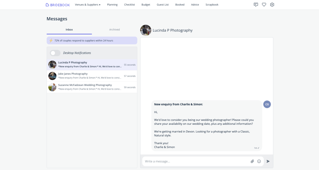
Messaging: Say Goodbye to Wedding Spam
Bridebook’s messaging system is genius. No more wedding spam clogging up your inbox—everything stays in one tidy place. Pre-drafted inquiries save you the trouble of figuring out what to ask, and notifications keep you on top of replies. They even have a “your turn” feature, which is like having a polite friend remind you to follow up.
Advice and Scrapbook: Hits and Misses
Bridebook’s advice section is a treasure trove of articles, from “How to Save on Flowers” to “Top Ceremony Songs.” There are 98 pages of content (yes, I counted), but the filters make it manageable.
The scrapbook? Meh. It’s basically a place to upload photos and notes, but it’s no Pinterest. If Bridebook could integrate inspiration feeds or swipe-to-save functionality, it’d be a game-changer. For now, I’ll stick to pinning.
The Verdict: Bridebook Is a Keeper
Bridebook isn’t perfect, but it’s close. It’s the supportive, slightly overachieving wedding assistant you didn’t know you needed. Here’s the final rundown:
What Slays:
- The checklist is organised and satisfying.
- Messaging keeps supplier conversations streamlined.
- Budget tracking demystifies costs for first-timers.
- The venue search feels expansive (once you tame the filters).
WWhat Needs Work:
- Scrapbook functionality feels outdated and uninspired.
- Venue filters can feel overwhelming and clunky to use.
- Supplier profiles need more creative content—like Instagram feeds, videos, or a portfolio view.
Would Love to See:
- Integrated payments for streamlined transactions and standardised contracts, would build trust.
- A help option—whether a forum, chatbot, or a real person to call for advice.
- Wedding website option, so everything can be managed in one place.
If you’re planning a wedding and need help managing the chaos, Bridebook is absolutely worth a try. Just bring your own Pinterest board for inspiration.
What do you think?
Have you tried Bridebook or another wedding planning app? What features do you think would make planning stress-free?
Let’s discuss in the comments—I’d love to hear your take!
Some snaps from our EPIC wedding—sorry, couldn’t resist! 🤍


Leave a comment